Mathew Panzarino at Tech Crunch is one of the most intelligent people writing about Apple these days. I was pleased to see he spent time with Craig Federighi (Apple’s Software chief) to talk about Stage Manager.
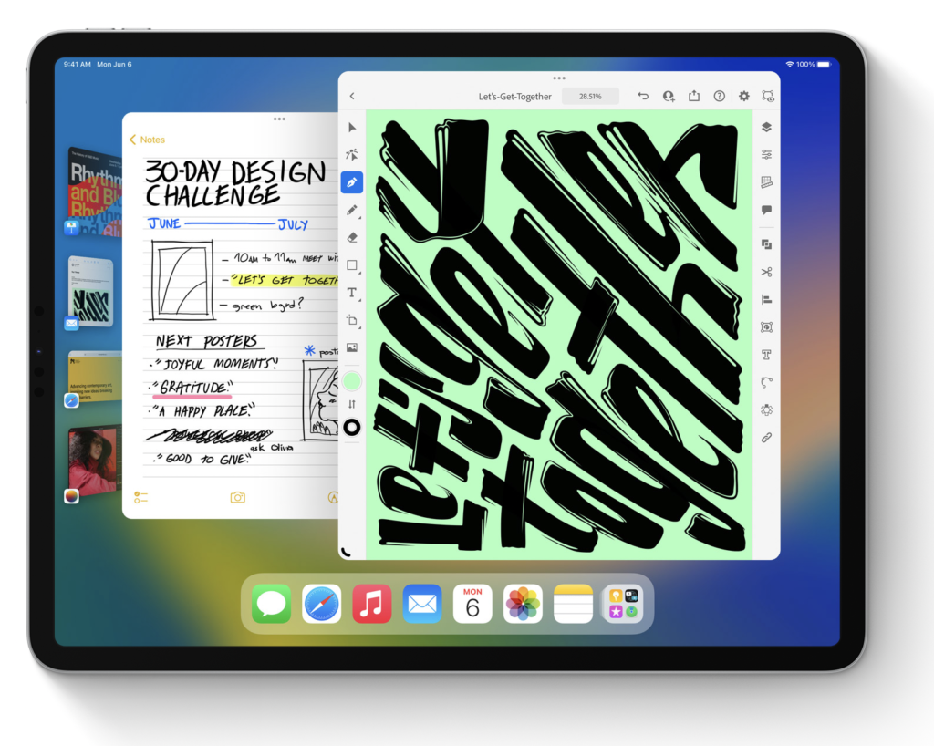
If you’ve been under a rock the last week, Stage Manager is Apple’s new attempt at multitasking. It uses stacks of related apps (that you create) along the left side of the screen. It works on both iPad and Mac, and taping (or clicking) on any stack of apps minimizes the existing apps and opens the stack of apps in its place.

Interestingly, Federighi disclosed that this feature was not designed for both iPad and Mac from the get-go, but instead, both teams had similar designs that approached one another.
From Federighi, “There were many of us who use the Mac every day who really wanted this kind of focused experience that gave us that balance. So we were on the Mac side, picking this idea up and saying we think that’s in reach, we want to make this happen. And separately on the iPad side we were thinking about [it]. And believe it or not two independent teams who are brainstorming and designing converge on almost the identical idea.”
The Stage Manager on iPad requires an M1-equipped iPad. While that’s a bummer if you are using older hardware. I don’t believe this is Apple trying to get you to buy a new iPad but instead what it seems: a feature enabled by new, more powerful hardware and additional memory. Federighi explains at length in the Tech Crunch article, “It’s only the M1 iPads that combined the high DRAM capacity with very high capacity, high performance NAND that allows our virtual memory swap to be super fast …”
I’d also note that Stage Manager lets you run four simultaneous iPad apps (or eight if you have an attached external screen). We’ve all been asking Apple to take advantage of the powerful iPad hardware. Now it has.
I’ve been using Stage Manager now for a week. I have opinions from two angles, the iPad and the Mac. For the iPad, Stage Manager is what I would call vertical improvement. It substantially improves multitasking and adds options that weren’t there before. Moreover, it is immediately accessible. I think many folks who don’t pay any attention to things like WWDC and MacSparky are going to latch onto Stage Manager on their iPad and suddenly start multitasking. I’ll be shocked if this one isn’t a winner. Already, I have stacks on my iPad of communication apps, research apps, and writing apps that I can jump between with just a tap. It changes the way I use the iPad.
On the Mac side, I would call it a horizontal improvement. Stage Manager isn’t necessarily better than some of the other options, like Spaces or using automation. It’s simply different; It’s another option. It’s better in some ways, like how accessible it is. It’s worse in other ways. You do lose some screen real estate, and at this point, it isn’t particularly keyboard friendly. I’m unsure where I will land with Stage Manager and the Mac. I think of someone like my wife, who finds Spaces completely baffling, will easily be using Stage Manager on both her iPad and her Mac.
And I think that is part of the point. Using the same paradigm on the iPad and Mac makes it much easier for most users to adopt and use the paradigm. People who figure it out on the iPad will want it on their Mac and vice versa. Not everyone is nuts enough to write an AppleScript to set up their writing applications.
In my initial testing, Stage Manager feels like the best window management system Apple has ever put on the iPad and perhaps the most accessible window management system Apple has ever proposed on the Mac. The trick is holding everything to that one screen. In the TechCrunch article, Craig Federighi also explains that the Stage Manager system is still evolving and will change throughout the betas. I am looking forward to its evolution.
