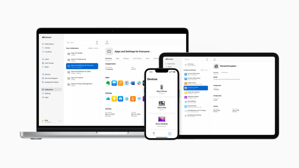
A few months ago we interviewed Jeremy Butcher from Apple on the Mac Power Users about their new Apple Business Essentials program, which is now available to all small businesses in the United States.

A few months ago we interviewed Jeremy Butcher from Apple on the Mac Power Users about their new Apple Business Essentials program, which is now available to all small businesses in the United States.
I’ve been spending a lot of time figuring out how to get the most out of my digital calendar lately. We’ve been covering this in the MacSparky Labs but I’ve decided to also do a free webinar on Calendar Tricks. It’s all set for April 21 at 10:00 a.m. Pacific. I hope to see you there.

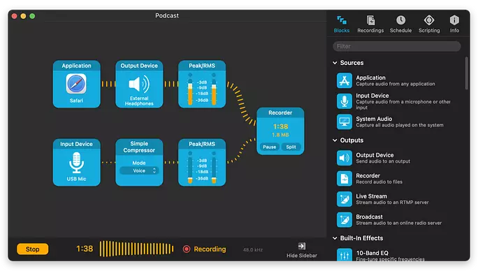
My congratulations to the gang at Rogue Amoeba on the release of Audio Hijack 4. Audio Hijack is my Swiss-Army Knife for audio on my Mac. Rarely do I run into a recording problem that I can’t solve with Audio Hijack. For example, when I record a Podcast, I make three recordings: 1) me alone; 2) the other person alone; 3) the two of us together. All three of those recordings are made with a single Audio Hijack workflow.
The new version keeps all of Audio Hijack’s features and adds a bunch of new features:
Powerful New Blocks
The “Mixer” block makes it easy to mix up to 5 sources, while the “Magic Boost” and “Simple Compressor” blocks provide potent audio adjustments with minimal configuration.
Improved Input and Output Blocks
To avoid inadvertently using sub-par built-in mics, the input block now requires you manually select a device, and it visually distinguishes built-in devices. As well, the Input and Output blocks also now include a “Track” option, to follow the default devices set system-wide.
Additional Block Improvements
All blocks now offer popovers, allowing them to be pinned for easy viewing and access when Audio Hijack is in the background. As well, block titles can now be edited, particularly helpful when using multiple blocks of the same type.
Manual Pipeline Editing
An oft-requested feature, it’s finally possible to edit the precise block layout of your sessions manually. We experimented with both modeless and moded manual connections, and have found this moded system to work best. Note that Undo is well supported, so fiddle without fear.
Scripting
Speaking of oft-requested features, Audio Hijack now supports scripting via JavaScript. The eventual goal is to allow you to configure and automate everything you’d want. For 4.0.0, we plan to have a solid skeleton, one which we’ll flesh out further in subsequent updates. Try it out in the “Scripting” tab of your sessions, as well as via the Shortcuts app on macOS 12 (Monterey), and let us know how it works for you.
Background Sessions
Audio Hijack sessions can now run without their window being open. Handy!
Menu Bar Control
In conjunction with background sessions, the new Audio Hijack status item provides global control from the menu bar. This global window can also be pinned, for instant access from within any application.
Always-On Sessions
With the new “Auto Run” control, you can configure sessions to run whenever Audio Hijack is launched, or even whenever your Mac launches. Have sessions running at all times, automatically.
Interface Refresh
Nearly all of the artwork within Audio Hijack has been updated and improved, and a brand new Light mode has been added. Sessions are now more robust, with Recordings and Timers contained within each session itself.
I’ve been using the updated version for the last several episodes of my podcasts and it is working without fail. If you are looking for some powerful audio tools on your Mac, look no further.
On this week’s episode of Mac Power Users, the topic of HEIC vs. JPG images came up. Sometimes you’ll end up with an HEIC image on your Mac that you want to upload or otherwise share somewhere that only accepts JPGs. So I made a simple Quick Action in Shortcuts to do the conversion. A link to the video is below and you can download the Shortcut with this link. If you dig this sort of thing, you should check out the MacSparky Labs.
The iPhone has all but killed the point-and-shoot camera market. On this week’s episode of Mac Power Users, Stephen and I talk about the hardware and software that makes the iPhone such a good camera for photography.
This episode of Mac Power Users is sponsored by:

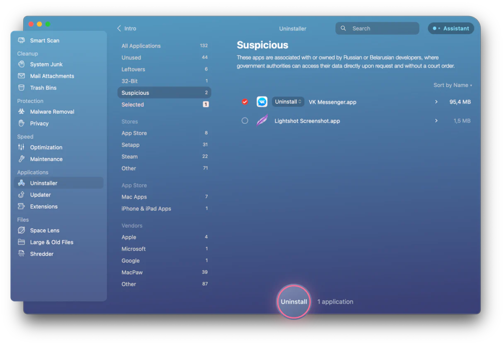
MacPaw, the Ukrainian company I wrote about a few weeks ago, has announced an update to their CleanMyMac X app with a new Suspicious Apps category to identify quickly, review and remove apps originating from Russia and Belarus to protect users from potential cyberthreats.
Legislation in Russia allows government and affiliated companies to access private information stored on servers in Russia without user consent or a court decision. Consequently, apps made or hosted in Russia and Belarus put your data at risk of government inspection at a minimum.
Of course, deciding what apps are safe and what apps are not is essential. The CleanMyMac X team does its best to avoid bringing safe apps to the suspicious list. Before making a decision, they use information from different sources, ask security experts, and contact the app developer whenever possible and reasonable.
I’m sure the MacPaw team has a lot on their plate right now, but as governments worldwide get increasingly aggressive about user data, I hope to see this feature expand. If you’re interested in CleanMyMac X, I’d recommend a Setapp subscription.

My thanks to MacSparky’s sponsor this week, SaneBox. One of SaneBox’s nifty features is that it can keep your email attachments in the cloud. If you’ve got Dropbox, Google Drive, Box, Evernote, or IBM Smart Cloud, any attachments that come through your email account can be automatically uploaded to your favorite cloud service with SaneBox’s SaneAttachments feature.
Some attachments, especially larger ones, can be trouble. They can fill up your storage or be hard to find. Some take too long to download and forward, especially if you’re using a mobile device. SaneAttachments solves these problems by automatically moving your file attachments from incoming emails and organizing your attachments, making it easy to find. And you can still forward these emails as you normally would, or you can send someone the link to the attachment. This way, you can keep your inbox fit and trim and make sure that only important email stays, and you can still find and get your files when you need them.
You can try SaneBox out for yourself. Use this link to sign up for a free trial and get a $10 credit you can use towards a SaneBox subscription.
Yesterday John Siracusa announced he is leaving his day job to focus on his creator work. I’ve always felt a certain kinship to John. We both have kids about the same age. We’ve both stuck it out at the day job probably longer than we should have, but for entirely good reasons. I wish him the best. Now I’m off to subscribe to “Robot or Not.”
Today CARROT Weather released its latest update with the addition of locations lists, tab bar customization, and new layout sections. To me, CARROT Weather is the poster child app for user interface customization. With this latest update, the developer just further piles on. CARROT Weather lets you, in essence, design the user interface to match your own needs and desires. I wish more app developers would follow suit.
Chris Bailey is back on the latest episode of Focused to talk about his dopamine fast, the art of savoring, and avoiding the productivity racket.
This episode of Focused is sponsored by: