Home Screens — Joe Moyer

Joe Moyer is writing some great stuff over at his blog, 24 Letters. That name comes from an Athenodorus quote, “Whenever you feel yourself getting angry, Caesar, don’t say or do anything until you’ve repeated the 24 letters of the alphabet to yourself.” Of course Joe and I get along great! So, Joe, show us your home screens.

What are some of your favorite apps?

Craft has become my favorite app. I use it every day on all of my devices, and it’s a big part of how I keep track of what’s going on.

Readwise is another favorite that I interact with a lot. I post quotes weekly on the blog and have just started an Instagram account. I like starting my morning with the highlights email because it can help inspire new ideas and positively shape the day.

CARROT Weather is a favorite too. It’s so useful and such a thoughtfully designed and customizable app. It has a prominent spot on my iPad and iPhone, and I often check it. 

I listen to a lot of podcasts, so I’m in Overcast often. I like the redesign a lot. It was an improvement without changing how I use and enjoy the app.

I use Day One to write a daily gratitude entry. I created a simple prompt and have a Shortcut set on my devices and my newly acquired Stream Deck. I also do deeper reflection in a separate journal, and I enjoy having separate spaces for the different types of writing. 

For task management, my favorite is Todoist. I’ve been a subscriber for several years. I like the Kanban board style view to track larger projects and used it at my most recent corporate job to track the performance reviews I was responsible for every year. I like the natural language processing and the ease of use. It feels lightweight yet comprehensive.

Which app is your guilty pleasure?

Instagram. I enjoy staying connected with friends and family and following creative people on the platform for inspiration. I recently created an account for the blog at https://www.instagram.com/24lettersnet/to experiment and see how I can be creative in a different medium.

What app makes you most productive?

Craft is where I go to be productive. I organize the blog and elements of my personal and family life and find that it’s a joy to use and helps me stay on track with projects. I do my monthly and quarterly reviews in it as well.

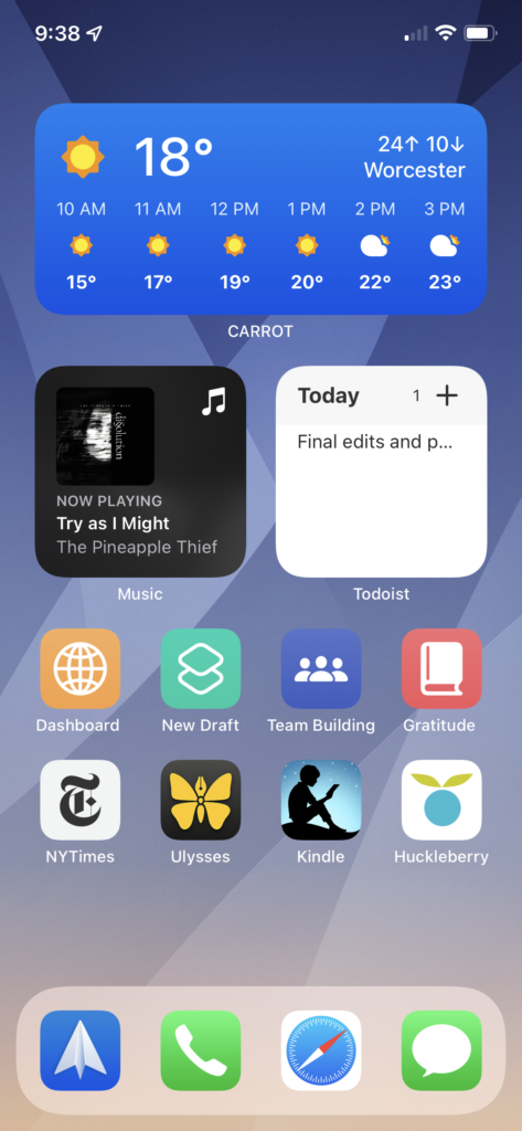
I created a dashboard in Craft where I manage everything and have a shortcut on the Home Screen of both my iPad and iPhone. It’s constructive to see things at a glance.

Craft is a beautiful app, too, so that helps!

My runner-up is Ulysses. I’m using that to write the blog entries, and I like how clean the interface is. I can jump right into writing without distraction.

What app do you know you’re underutilizing?

Shortcuts! I’ve created a few simple shortcuts on my Home Screen, like opening a specific MindNode project or opening my daily gratitude journal in Day One. I like how it improves my focus and gets me to where I want to be quickly.

I’m deeply interested in focus and productivity and look forward to exploring Shortcuts more actively in the future!

What is the app you are still missing?

I still don’t have a great calendar app that I love. I’m going to explore Fantastical in the future. Right now, my “day job” is as a stay-at-home dad, so my schedule is rarely my own anyway!

How many times a day do you use your iPhone/iPad?

I’m on my iPhone a lot because I use it for everything from tracking my toddler’s daycare and my infant’s feeding and nap schedule, to organizing tasks and lists, messaging, and working on projects.

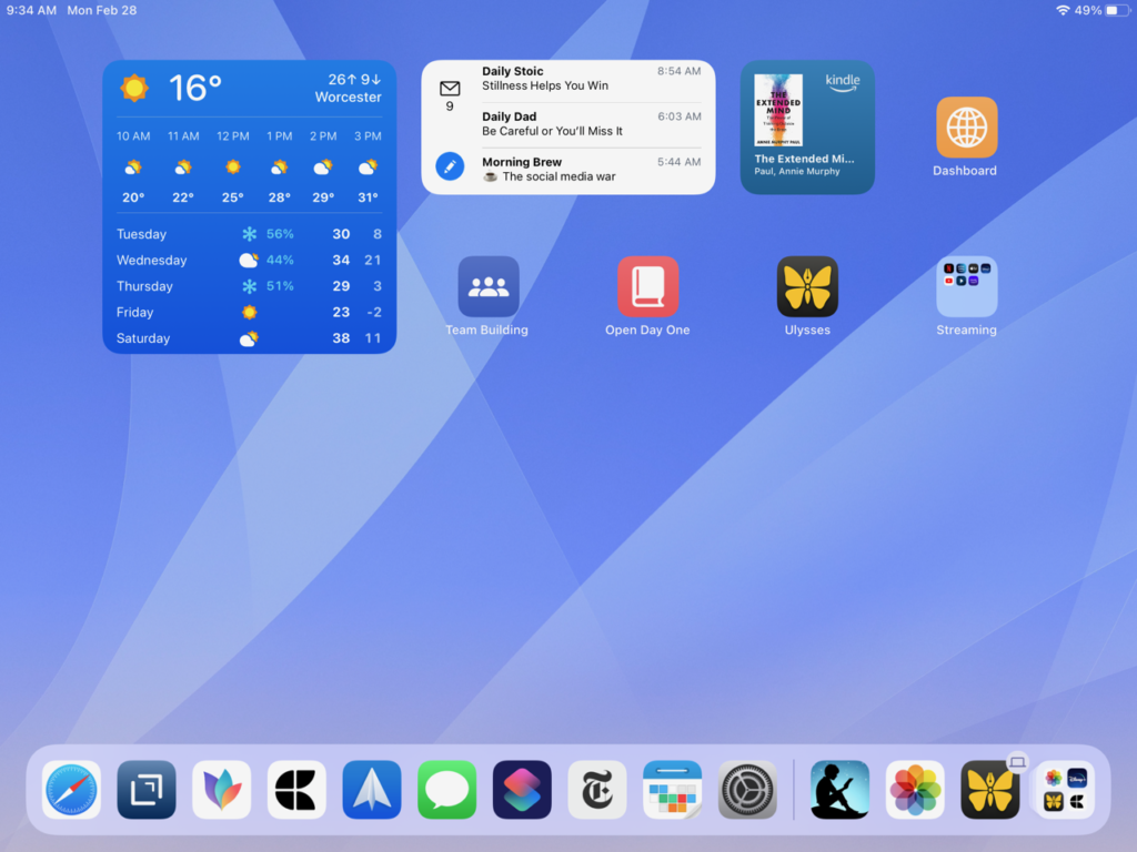
I am on my iPad several times a day as well. I use it as a tool for consumption, review, and idea creation. I watch content from YouTube and the big streaming services, read books on Kindle or news on the NYTimes app, or check in on my dashboard in Craft. I also like to do my monthly and quarterly reviews on the iPad.

What Today View widgets are you using and why?

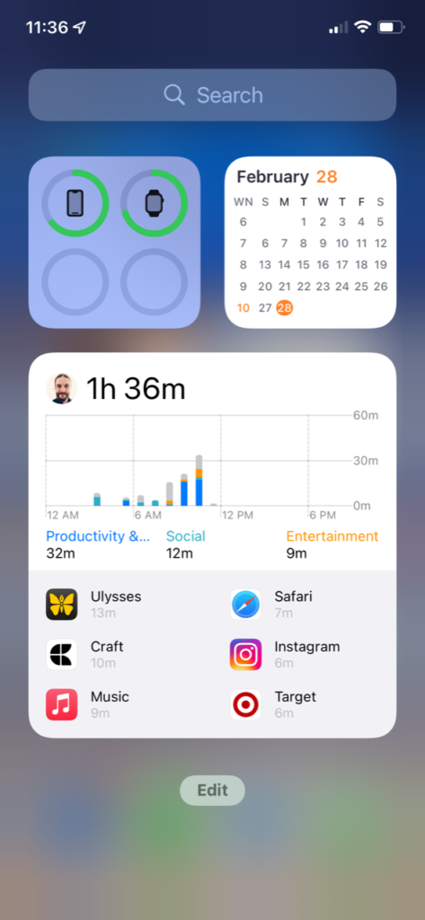
I keep my Today View pretty simple, with my battery status on the top left, the month view of my calendar on the top right, and below that the productivity widget from Todoist because it’s fun to see my stats. I also keep my screen time widget here to see where my attention and efforts are going.

What is your favorite feature of the iPhone/iPad?

On iPad, split-screen went from something that I struggled to remember how to use effectively to something that I use all the time. Apple fixed that so successfully.

My favorite feature on the iPhone is Focus. I know it’s not exclusively on iOS, but that’s where I find it to be most helpful. I wrote on 24 Letters about how it helps me stay on track with my sleeping (despite a four-month-old baby’s best efforts not to sleep!).

If you were in charge at Apple, what would you add or change?

I’d provide more than 5 gigabytes of iCloud storage when someone buys a new iPhone. It’s just not enough!

Do you have an Apple Watch? Show us your watch face tell us about it.

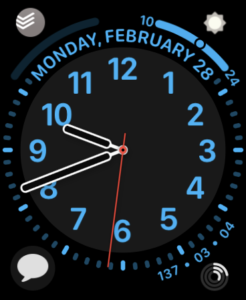
I have an Apple Watch Series 5 that I love. My complications include Messages, Activity, CARROT, and Todoist. I regularly use dictation to compose messages, and that’s even more helpful and necessary after a recent wrist injury.

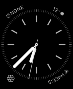
I use the California face during the active part of my day and have an automation to change to the Simple face in the evenings. I got the idea from an MPU episode, and I do this to help shift the context from the busy task-filled days to a more gentle data set for evenings and overnights.

On the Simple face, I have the alarm, sunrise/sunset, CARROT, and mindfulness complications.

My Apple Watch is several generations behind now, so I’m interested in what the Series 8 will look like.

What’s your wallpaper and why?

I’ve been using the Aqueux wallpapers on my iPhone and iPad for a while now. The iPad Lock Screen often has a recent family photo, but I prefer to keep the home screens simple to avoid visual distraction.

Anything else you’d like to share?

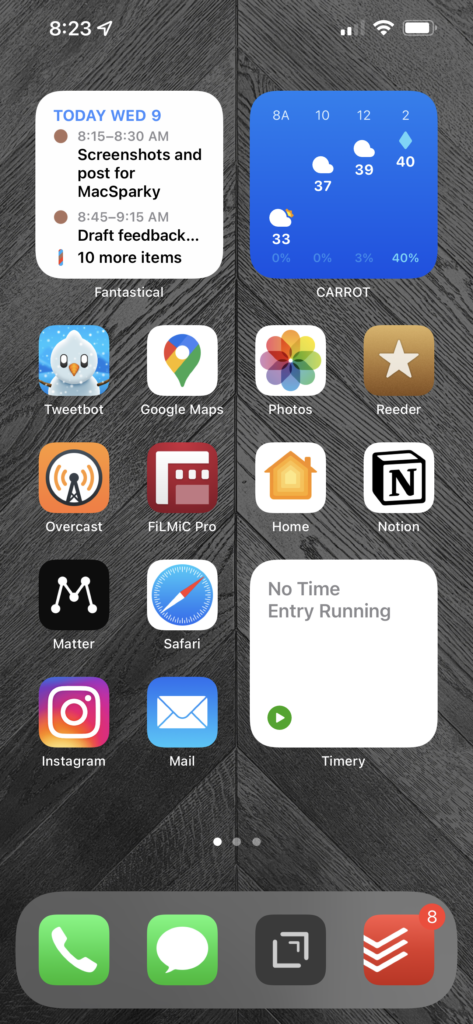
I’ve taken advantage of widgets and stacks, particularly on my iPhone. Apple Music and Overcast share a small stack, and Todoist, Calendars, and Photos share another.

CARROT gets its own medium widget space just because there’s so much data that I want at a glance. As I write this, it’s 62°, and yet there’s a winter storm watch for the coming days. Massachusetts weather is a mystery!

I keep things more straightforward on my iPad. I want to be able to unlock it and jump right in, whether it’s for creating or relaxation.

Finally, I want to say how much I enjoy this community. I’ve been a Mac user for almost 20 years and have followed MPU and many Relay FM podcasts for years. The MPU forum is practically a daily visit for me, and the positivity, kindness, and support that everyone gives each other is refreshing and welcome. I’m excited to share my voice as well, both on the forum and on my blog

Thanks, Joe!

Jim Eagar’s Home Screen

This week’s Home Screens features Jim Eagar. Jim is a retired US Air Force Reserve, JAG (and Chaplain before that), as well as a retired estate planning attorney. Jim is also a first order Mac Geek with his website at OriginalMacGuy.com. So Jim, show us your Home Screens.

What are some of your favorite apps?

MindNode is foundational to every project I work on. I use it to mind map negatives, positives, and other factors when I have a big decision to make. I mind map presentations that I make to my local community Apple group before putting together my Keynote and screencasts.

Unless it’s a simple post, I mind map the content and structure of blog posts before I write them. If a blog I’m working on requires some research, I’ll often insert an article name, author, link, and quotation directly into the appropriate node in MindNode, then transfer the info to Ulysses if I decide to use it when writing. I typically write blog posts with half of my screen showing Ulysses, and half showing MindNode. The one and only simple shortcut I’ve designed arranges these two apps in that configuration.

For my roles-based productivity system, I keep a list of my roles, ideal descriptions, answers to my “tough questions” and action steps in a large mind map. I use this when I go on 6-month retreats away from home to work on my roles system.

The graphical presentation of MindNode works much better for me to organize my thoughts than using a traditional outline. I can visualize my thinking and see connections between sections, and drag and rearrange with ease. I can see where there are gaps that need additional research or thinking to fill in. MindNode saves me hours in rewriting and helps me to produce much better blog posts, screencasts, and Keynote presentations.

Drafts is another primary app for me. Almost everything starts in Drafts. It’s my initial writing app for thoughts I’m not ready to put into my formal write-edit-publish process. I also use it to quick-capture ideas I have on the go (with the app on my Apple Watch).

I maintain an updated list of ideas for blog posts. Furthermore, I keep a few items I want to have instant access to — things like Kourosh’s task words, my updated roles descriptions, and Alfred keyboard shortcuts.

I have a template in Drafts that generates my weekly review. It includes my role descriptions and ideals, a “checklist” series of questions I intend to ask myself each week, and app locations I want to check each week.

I use Alfred constantly to open apps and find files and folders. Since my original 128K Mac, I’ve been in the habit of clicking on app icons, but this past year I’ve been transitioning to mostly using Alfred.

Another feature I use multiple times a day in Alfred is the clipboard history. When I’m researching for a blog post, I can copy the names of articles, links, author’s names, and quotations without constantly having to jump back and forth between my source and the app I’m writing in.

Things is my task manager of choice. I tried OmniFocus , but found it too complicated and fiddly for my simple needs.

I use Things to keep track of all of my tasks that don’t go on a calendar, including projects. I also maintain checklists for routine activities, such as actions I take when I post to a blog. I have recurring tasks for everything that I do on a recurring basis, including household chores, medication refills, and weekly reviews.

I love the simple, beautiful look of Things. To me, aesthetics are important, and I like beauty in as many technology spaces as I can have it.

I use Feedly several times a day to read RSS feeds from blogs in the areas I keep up with. I’m aware that Reeder is the cool app, but I never cared for its layout and prefer the layout of Feedly. I find it easier to use. It still amazes me that I can let one app gather posts from blogs scattered throughout the internet, and I can sit down and read them all in one convenient location.

Which app is your guilty pleasure?

I use Facebook to stay in touch with some long-distance acquaintances and to keep up with many hobby area groups (backpacking the Arizona Trail, WWII strategic gaming, and WWII history) that only have Facebook pages. I also use my account to advertise my two blogs and often post reading highlights from Readwise. I limit my review of Facebook to 5-10 minute time blocks once a day.

What app makes you most productive?

For mental creative work, it’s MindNode. It’s in MindNode that my blog post ideas and other projects take form. I typically start with a single thought or topic, then expand it into related sub-topics, then flesh those out. In MindNode I create what my writing or project will look like, and the logical and research steps I need to go through to complete it in concept.

For actual production work, I’d have to say Ulysses. I do almost all of my writing in Markdown in Ulysses. I have folders to keep track of the things I’m writing, from initial draft to publishing. At a glance, I know what I’m getting ready to write, writing, editing, waiting to publish, and have published.

When I’m ready to publish a blog post, I can post it to the appropriate WordPress site directly from within Ulysses. It transfers links, inline images, and a featured image for the post. I can also update it in Ulysses, but I typically do the final review and editing in WordPress.

In addition to using the free version of Grammarly, I also use the proofreader and editing assistant built into Ulysses. I find it’s very helpful and improves my writing.

What app do you know you’re underutilizing?

DEVONthink. Presently, I’m using it for the storage of PDFs, photos, mind maps, and whatever other types of documents I want to keep. I extensively use the web clipping function and sometimes change document formats in it. But I know there are a ton of other things I could be using DEVONthink for. It’s an extremely feature-rich app.

I have David’s DEVONthink Field Guide which is an excellent resource but haven’t worked all the way through it yet. And half of what I did work through, I quickly forget because I don’t implement it regularly.

How many times a day do you use your iPhone/iPad?

I use my iPad probably 5-15 times a day, sometimes more. I start out with my 11” iPad Pro and a cup of coffee on the sofa in the early morning for my morning routine (which is app-based). In addition, I use it many times each day to enter items into my daily food tracker, FoodNoms, look up things in Safari, check my task manager, and mark off completed tasks.

My iPad is my comfortable go-to device for reading and initial photo editing and viewing. I also use it to sketch out initial mind maps on MindNode and journal in Day One.

I don’t use my iPhone 13 Pro much when I’m home. The font size is too small for my older eyes to do much productive work with it. I use it for telephone calls, but I don’t like talking on the phone and avoid it if possible.

I use Messages and Apple Mail when I’m out and about and need to respond to something. When I go grocery shopping, I use checklists I’ve built in Apple Notes. I use Apple Maps to give me directions anytime I’m traveling somewhere that I’m not familiar with.

Ironically, I get the most use out of my iPhone when I’m on a backpacking trip with no cell service. When doing a section hike on the Arizona Trail, I use a map app called FarOut. This gives me contour maps and shows me my location on the trail (or, sometimes, off it!). I use the MapMate app to connect by Bluetooth to my Garmin InReach Mini satellite communicator to send texts and emails when cell service isn’t available. All during the day while hiking, I’m typically taking landscape photos and videos with the iPhone’s excellent camera. In the evening, I increase the font size in Kindle to read books and perhaps listen to some downloaded music.

What is your favorite feature of the iPhone/iPad?

My favorite feature of the iPad is the ability to design custom Home Screens. I didn’t even know that was possible until Focus Mode came out this past year, and I discovered the ability to make different Home Screens for different Focus Modes.

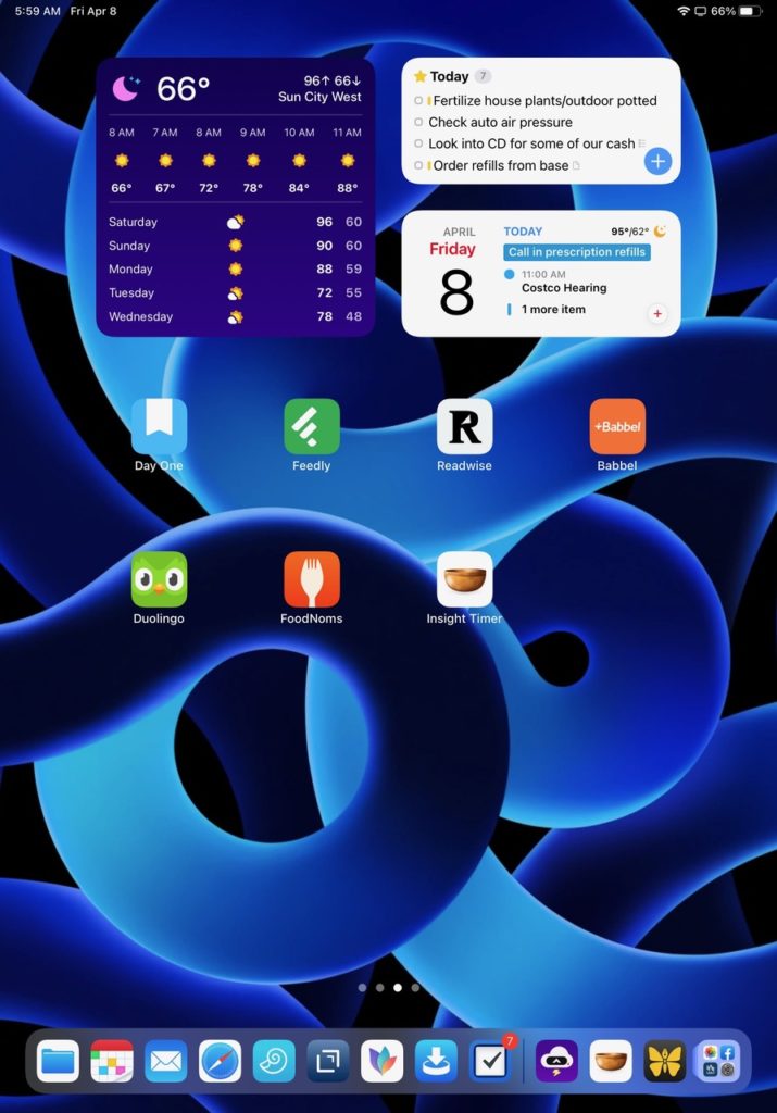
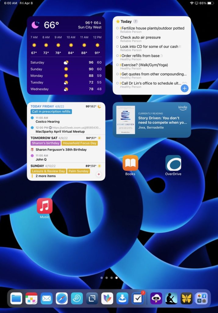
I use custom Home Screens for three purposes: 1) My morning routine screen, which is made up of apps and widgets, 2) My reading screen, and 3) My exercise Home Screen.

I have a custom Home Screen for the morning routine I follow every day. I recently wrote a post describing my morning routine process, “A Morning Routine that Works – An App-Based Approach.”

I use a series of ten apps to complete my morning routine. This was not something I intentionally planned, but developed over time. These include widgets for CARROT Weather, Things task manager, and Fantastical calendar. I use app icons for Day One, Feedly, Readwise, Babbel and Duolingo (learning Spanish), FoodNoms, and meditation with Insight Timer. Using apps for each function makes my morning routine visual and easy to follow (just follow the trail of apps), and increases the probability that I will actually do what I intend to do.

My reading Home Screen contains the widgets for CARROT Weather, Things, Fantastical, and Amazon Kindle. I also include the app icons for Apple Books, OverDrive (library loans), and Apple Music for background music if desired.

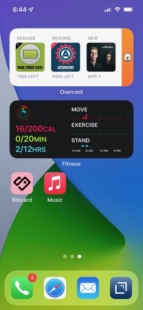
My exercise custom home page includes the Overcast podcast widget, the Apple Fitness widget, the Stocard app (a wallet app that includes my scannable membership card for the recreation center), and the Apple Music app. My exercise focus mode activates when I arrive at the recreation center and automatically shows my exercise Home Screen, so everything I need is waiting for me.

Over time, I’ve found that my morning routine Home Screen is the screen I use all day unless I’m reading. If I want to use an app, not on the screen, I just swipe down to open the search bar and type in the name of the app I want.

Do you have an Apple Watch? Show us your watch face and tell us about it.

My wife and I have had Apple Watches since they first came out. We ordered ours when they were made available, and received them in the first shipment. We’ve loved them ever since! We’ve upgraded a couple of times and now have version 7. One of the times we upgraded was when they came out with automatic fall detection. We were in our 60s, and that sounded like something we might potentially benefit from! (Remember those “Help, I’ve fallen and I can’t get up” commercials?)

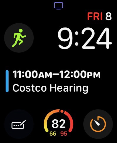
I’ve used the Infograph Modular watch face since the beginning. I’ve tried a few of the other watch faces, but always wind up returning to it. It’s not the most stylish, but it is the most functional and easy to read. From the upper left to the bottom left, I have the workout complication, the day, and date, the time, my calendar, the Drafts complication, the weather, and the timer.

The Drafts complication is of special note. When I tap on it, it opens, and I can tap on the microphone option when I’m ready to begin dictating. It syncs almost immediately to all of my devices.

What’s your wallpaper and why?

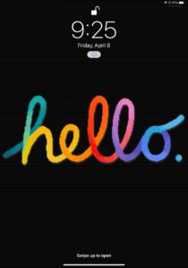
On my Lock Screen on my iPad, I use the multi-colored “Hello” wallpaper in black by BasicAppleGuy. I use it because it makes me happy to be greeted with that classic Mac look when I open my iPad! For my Home Screen, I use the dark blue swirl pattern from Apple that debuted with the iPad Air 5. It’s colorful and interesting, but doesn’t overpower the app icons.

I use the same wallpaper on my Lock Screen and Home Screen on my iPhone. It’s the Blue-Green-Grey wallpaper that comes as a wallpaper option with the iPhone 13 Pro. I use it because it has darker, subtle tones and doesn’t make it hard to pick out apps.

Anything else you’d like to share?

I’ve been aware of some productivity books like Getting Things Done for about ten years, and I’ve been an Apple fan since my original 128K Mac in 1984. But it’s only been in the last six years that I’ve spent much more time learning about how to productively use apps, and the whole area of productivity.

For me, the most important material I have encountered that has built the foundation and continues to inform my productivity system is David’s roles-based approach.

If you’d like more information about my system, I’ve recently written a blog article, “How a Roles-Based Productivity System Brought Clarity and Purpose to my Life in Retirement.” I’m sure it’s not for everybody, but it’s made a huge difference in my life and my productivity system.

Thanks, Jim!

Home Screens — Eric Welander

Allow me to introduce you to Eric Welander. (@ericwelander on Twitter.) Eric loves Apple smart home tech, which you can watch here, and earns his coin by building iOS apps. So, Eric, show us your Home Screens.

What are some of your favorite apps?

I don’t know where my life would be without Drafts. I use it to quickly capture ideas I have, either on my phone or on my Apple Watch. Then I have an action to send them to Obsidian, or I copy-paste them to the proper project in Notion.

I love Reeder for staying up to date on Apple and tech news. The design is subtle and absolutely stunning. I connect Reeder with Feedbin where I have RSS feeds and email newsletters. As a YouTuber, I also use Feedbin to watch when certain channels post new videos. I find this chronological timeline easier and more passive than YouTube’s systems for not missing a video from my favorite creators. Getting to the videos over in the YouTube app is a few extra taps, but that’s not Reeder’s fault.

Which app is your guilty pleasure?

Instagram. I love following all kinds of interior design and luxury home builders on Instagram. It’s an extension of my love of smart home tech that I talk about on YouTube. That said, as a part-time creator, I’m terrible about sharing on Instagram as much as I probably “should”. YouTube and Twitter are more my cup of tea for that. One fancy home-related account that’s a great follow on Instagram is Mike Kelley (@mpkelley_).

What app makes you most productive?

Todoist. I’ve been using Todoist as my task manager since I moved over from Things in 2019. The biggest change that took it to another level for me was separating project and task management. Todoist is full of chores and things I have to do. Notion (previously Trello) is where I manage my projects and related tasks that move the needle. While Todoist isn’t the most beautiful task manager, the natural language processing for task entry and their web API make it too easy to keep using. And because I have this separation of chores and project related tasks, I can easily chuck one or the other (or both!?) out the window.

What app do you know you’re underutilizing?

Matter. I recently switched from Instapaper to Matter for read-it-later content. I’m just barely scratching the surface of what Matter can do. I still need to set up highlight syncing with Obsidian, like I have with Instapaper. Beyond that, the stuff that Federico Viticci is doing with Matter over on MacStories is mind-blowing.

What is the app you are still missing?

I love using Obsidian for notes, but the iPhone version is clunky and difficult to use. I would love a much faster look into my Obsidian database and ways to add thoughts on the go. Right now, that is Drafts for me. Drafts is great, but it’s a one-way street where I’m not able to connect ideas with other Obsidian notes.

How many times a day do you use your iPhone/iPad?

According to Screen Time, I pick up my iPhone around 42 times a day.

What Today View widgets are you using and why?

A lot of my widgets in the Today View are pretty standard, but I want to call out David Smith’s Sleep++ Sleep Goal widget. This is a great way to know how much energy I will probably have for a day, to help know how much I can actually take on. I usually have to tap the widget and open the app to get it to update, but that’s fine with me and probably not David’s fault.

I also like using favorites in Notion and the corresponding widget for quick access to my dashboard and to show projects I’m actively working on for my content creation. As I film B-roll, I will jump into Notion on my phone to check off shots I need to get.

What is your favorite feature of the iPhone/iPad?

Apple’s cameras are so good these days and frequently praised, but their screens are quickly becoming just as amazing. The screen on my iPhone 13 Pro Max is absolutely gorgeous, and it makes content I’m looking at really pop.

If you were in charge at Apple, what would you add or change?

I would tell the iPad team to make a battery-less entry-level iPad you could hang on the wall in your home. I would also assemble a software team to make a homeOS for this product with HomeKit controls. I would also want it so that members of an iCloud family could share eligible, custom iOS widgets to remain on the display. Apple would probably need to build a way developers could make certain widgets eligible for Family Sharing, but I’m sure they would pull it off in a secure system. Oh, and go ahead and ship Family Sharing for photo libraries too … please and thank you!

Do you have an Apple Watch? Show us your watch face tell us about it.

I’ve never been fully satisfied with my Apple Watch face. The California face seems to land the best compromise of data and style, I just wish there were more options for customizing the actual watch dial. I sleep with my watch on and use it as a silent alarm in the morning.

What’s your wallpaper and why?

I can’t find the link, but my wallpaper is an image I found around the launch of the Apple Tower Theatre store in Los Angeles in June 2021. I cropped the photo and turned it monochrome to be a subtle backdrop. I’ve had it on my phone since then, and I really like it. My Lock Screen is usually a family photo.

Thanks, Eric!

Home Screens — Jonathan Buys


Jonathan Buys.jpg

Jonathan Buys (website) shares his Home Screens this week. So, Jonathan, show us your Home Screens.


iPhone Home Screen.jpeg

What are some of your favorite apps?

I’m a big fan of the classics. BBEdit is my text editor of choice, I’m subscribed to 192 blogs in NetNewsWire, all my passwords are stored in 1Password, and OmniFocus keeps the madness at bay. I use third-party apps when the first-party apps from Apple don’t cut it, but the truth is that a lot of time the Apple apps do everything I need. Safari, Mail, Calendar, and Notes are daily drivers, I listen to music through the Music app, read PDFs in Preview, keep in touch with friends and family with Messages, and get my work done in Terminal.

When writing, I also use the built-in Dictionary app with a copy of Webster’s Unabridged 1913 dictionary. The language of the definitions are a work of art.

Which app is your guilty pleasure?

Probably Apple News. I try to limit my access to bottomless pits with endless timelines I can scroll, but since I’m subscribed to Apple News+ I still get lost in there from time to time.

What app makes you most productive? 

Without a doubt that’s got to be OmniFocus. I’ve been using it for so long now it just fits with the way my brain works. I’ve tried a few other apps over the years, but only OmniFocus gives me both defer dates and due dates for tasks. I assign due dates to things that have to be done on a particular day, like taking the trash to the curb, but I use defer dates for things that I have the option to work on that day. I was a GTD proponent before OmniFocus, but the OmniFocus Field Guide was instrumental in helping me integrate OmniFocus into my life.

What app do you know you’re underutilizing?

Without a doubt that’d have to be Shortcuts for iOS and soon to be for the Mac as well. I’m not sure if I have much use for it on my iPhone, but since it’s coming to my Mac soon I’m putting in an effort to learn it now.

What is the app you are still missing?

A really great Jekyll blogging app. What I’d love would be something like MarsEdit for GitHub Pages. I’ve thought a lot about building it myself, but there’s only so many hours in the day, and only so many of those that I want to spend in front of a computer and not outside.

How many times a day do you use your iPhone?

Too many! I try to keep my iPhone configured to be a tool and not an entertainment device. From time to time I’ll play a game on it, but for the most part my iPhone is my device for finding information, keeping in touch, and keeping me on track with my personal, professional, and health goals.

What Today View widgets are you using and why?


I actually had to swipe over to check and see what I had on the Today view. Looks like I use the default Smart Stack, the battery use widget, a Notes note(?) that I update occasionally when it makes sense, and the Screen Time widget to keep track of what I’m actually spending my time on.

What is your favorite feature of the iPhone/iPad?

My favorite thing about my iPhone is how I can get to the information I need anytime, straight away. If I want to check the balance of a bank account, that’s a tap and a login with Face ID. If I’m at the hardware store and I need to know the exact model number of my weed eater, that’s in DEVONthink To Go. If we are out browsing at the furniture store and my wife points out a set she likes, I’ll snap a photo and save it in Notes. It’s an information super machine.

If you were in charge at Apple, what would you add or change?

I wrote an article for my blog a few years ago about some changes I’d like to see made to macOS to make it more of a workhorse for knowledge workers. I’d like Siri to find related documents to what I’m looking at or have selected and have that available at a swipe in Notification Center. I’d like Siri to not only find documents for me, but file and name documents for me intelligently. Finally, I’d like iCloud Drive to encrypt everything end-to-end so I could finally use it without having to worry about sensitive company information leaking in what could possibly be career adverse ways!

Do you have an Apple Watch? Show us your watch face tell us about it.


My wife bought me a Series 3 a few years ago and I’ve been wearing it every day since. I mostly use it for fitness tracking, keeping an eye on the weather, and, you know, telling time. I also enjoy how it unlocks my iMac for me 😀. I’ve got my eye on what Apple releases for the Series 7 in the Fall though, I increasingly want the always on screen in the Series 6.

What’s your wallpaper and why?


On my Mac it’s the default Big Sur wallpaper. I like how bright and colorful it is. On my iPhone it’s a photo of some leaves I took in the Fall a few years back, reminds me that this summer heat won’t last forever!

Anything else you’d like to share?

Following Apple and being part of the community has been a fun hobby and a constant source of joy in my life for years. The things we get into here are of small consequence in the grand scheme of things … but it is fun, and I think that fun is enough. The developersdesignerswriterspodcasters, and creators of all kinds that come together to build and share the joy of a near future that we can almost see is something we don’t have enough of. Inside this community, every now and then we get a glimpse of the future, some amazing piece of tech or beautiful new design that inspires hope. The kind of hope that just breathes optimism into us all to consider that maybe we really can build a better tomorrow.

Thanks, Jonathan!

Home Screens — Jarrod Blundy


Jarrod Blundy (website) (Twitter) is sharing his home screens this week. He’s a pretty cool guy who has come up with some pretty nifty workflows. So, Jarrod, show us your Home Screens.

What are some of your favorite apps?

If I had to pick the Top Four apps that I’m in and out of every day, and that I love to use, it would be Reeder, Overcast, Things, and Drafts.

Reeder and Overcast are both for entertainment, and how I keep up on the news from my interests (technology, outdoor adventure, philosophy). I check my RSS feed in Reeder like other people check their social media and always have a healthy reading queue saved up (though I’d prefer to whittle that down — there’s just so much good stuff out there!). I used to use Pocket and Instapaper for saving articles, but Reeder’s built-in Read Later bucket, which syncs via iCloud, has met my needs well over a year now.

When I’m driving, doing dishes, laundry, or anytime I don’t need to focus too closely on the task at hand, I’ve usually got a podcast playing in my ears. While the playful design of other podcast apps, like Castro, have me giving some side-eye, I don’t think I could ever leave Overcast. The quality is too good, and it’s congruent with how my brain thinks podcasts should work. There, too, I’ve got more episodes lined up than I could listen to. That’s why my “Don’t Miss” smart playlist is where I turn first each day, and where Mac Power Users is surfaced as my Sunday cleaning podcast.

To-do items that are started in Drafts get sent to Things (there are many excellent actions to get them there), which is where all my projects live. I’ve tried all the task management apps — all of them — and Things has just enough complexity between Areas, Projects, and Tags to keep me organized without spending all my time fiddling around. It’s also the most beautiful.

I’ve worked hard over the past few years to get to-dos out of my head, and the combination of Drafts and Things has been vital. They also have great widgets, which I use on my iPhone and iPad to stay on-task with just a glance.


Layout:

On my first page, I’ve got “app pairs” between the Dock and just above it. Message/Phone, Safari/Spark, Things/Reminders, and Drafts/Notes just make sense in my head, and that’s where they’ve been for years.

The second page is for quickly dipping into entertainment and social media. I’ve got a stack of sound-related widgets above the apps. The main one you see in the screenshot is from Soor, and it lets you bookmark your most-used playlists, radio stations, and albums for easy access. I use two shortcuts as icons (TV Menu and YouTube) to get specific places in apps and the other apps on that page. Everything else is in the App Library.

Honorable Mentions:

iA Writer – A simple, beautiful, and powerful text editor for fleshing out ideas and writing longer pieces (like this one).

Spark – Again, I’ve tried all the big players in the email — most recently Big Mail — but I keep coming back to Spark. I don’t rely on a complicated folder structure, so the faster I can review mail and archive it, the better, and Spark has consistently been the best. It’s got a few power-user features like email templates, quick replies, and integration with Things, which I use regularly.

Swift Playgrounds – One of my newest hobbies is learning to code. There are many great resources and apps out there, but Playgrounds is where I’ve started. It turns out that turning lessons into games works for adults too, and I’ve been having a ton of fun learning to “speak” to a computer using code.

TV Forecast – This app helps me keep track of where I am in the seasons of TV I’m watching and stay updated on upcoming episodes. It integrates with the Trakt.tv service, and dispenses of extra features to deliver a straightforward and pleasing experience. Letterboxd is similar, but is for movies and isn’t quite as simplified.

Experiments:

Scan Thing – After Scannable by Evernote showed signs of neglect, I searched for an app that used the native document scanner and got me from scan to share as quickly as possible. Scan Thing does that and as a bonus has neat object scanning and text scanning (à la Text Sniper or Live Text).

Weather Strip – I’ve been a Dark Sky user for years and years, but I dabble with other weather apps too. Weather Strip is new to me and has one of the most intuitive ways of visualizing upcoming weather that I’ve ever seen. It’s like Weather Line but shows temperature, cloudiness, precipitation chance, and more all on the same graph. It’s got a generous one-month free trial and an inexpensive subscription after that. My only wish is for some alternative app icons.

All Trails – It’s not featured on my Home Screen, but I’ve been getting a lot of joy out of this app which highlights local hiking and biking trails. You can search anywhere in the world, and since many of the trails are crowdsourced, you’re able to find routes that you might not see on a local map.

Which app is your guilty pleasure?

If I go off my Screen Time data, it’s got to be a tie between Twitter and YouTube, but for very different reasons. Like my RSS feed in Reeder, I’ve got a growing list of YouTube channels that keep me entertained and learning. Signing up for YouTube Premium was a worthwhile investment since it cuts out so much time wasted watching or trying to skip ads, and I can keep my Watch Later playlist downloaded on my iPad for catching up anytime and anywhere.

My Twitter usage has drastically ramped up since WWDC last month. So many great new OS tidbits were shared there that it’s pulled me back in. I’ve been fortunate that my feed is still mostly filled with joy, and I’m not afraid to unfollow if someone gets too negative. Despite Twitter playing around with third-party API access, I think it’s neat that Twitter (the service) can still be a design playground for developers. I’ve been trying out Tweetbot and Aviary, which are both opinionated and both great. And, I’ll say it, the algorithmic timeline in the official Twitter app is perfect for quickly catching up on tweets.

What app makes you most productive?

That’s a tricky question because I’m between jobs right now. In my most recent position, it was Spark for unending email and Basecamp for collaborative projects. Until my new job starts, though, I’d have to say that Drafts and iA Writer keep me busiest writing blog posts. But my wife might tell you that Things makes me most productive because I’ve been able to catch up on some home projects that I’ve had saved there for months.

I’ll add that Brain.fm is a huge help for keeping me focused, no matter the task. Lyrical music distracts me and listening to lo-fi, jazz, or classical music for hours in Apple Music alters my recommendations. On the other hand, I’ve found that Brain.fm’s catalog of “music” is stimulating and has enough variety not to get repetitive.

What app do you know you’re underutilizing?

Shortcuts. While I’ve been using Shortcuts since the Workflow days, I feel that I’ve barely scratched the surface. I have more shortcuts saved than I regularly use, but there’s so much to explore. It’s the first automation platform that clicked with me, so I’ve been having fun creating tools that speed things up on my devices. What I also appreciate about Shortcuts is the community that has been built around it, and that it’s so easy to adapt tools shared by great folks like Matthew Cassinelli, the guys at MacStories, Chris Lawley, and more, to craft them to do what I need.

What is the
app you are still missing?

As you might have been able to tell, I’m a big “save-it-for-later” guy. So articles get saved in Reeder, podcasts in Overcast, and videos in YouTube — not to mention lists of books in Goodreads, TV Shows in TV Forecast, and movies in Letterboxd. What I’m missing is a bucket for music.

My music influx is from various sources — new albums from artists I follow in Music Harbor, recommendations via blogs and Twitter, discovery in the Music app — and it’s hard to keep track of all that. I’m reluctant to save something to my library without vetting it first, so I’ve been sending everything to a “Listen Later” playlist. It’s okay, but playlists aren’t meant for that bulk-in/bulk-out kind of management. For a while, I used Raindrop.io as a place to bookmark albums, but it bounced me around via Safari and wasn’t great.

My dream is a simple music-specific bookmarking app where I can send music.apple.com links. It would integrate with MusicKit to listen in-app and take action (send to a playlist, save to library, love, etc.) on the album, song, or playlist right there. Bonus points if it can keep track of the items I’ve finished listening to or that are still in progress, so I don’t have to remember what’s safe to archive. Double bonus points if it can accept links from other music services and convert them to Apple Music items.

How many times a day do you use your devices?

I’m a heavy screen user, especially while I’ve got some extra time at home, but I flow pretty seamlessly between my iPhone, iPad, and Mac throughout the day. Screen Time snitches on me, reporting an average of 10 hours of usage and 84 pickups per day across my devices. That’s higher than I’d prefer, but all of my creative work is happening on those devices. I’m actually watching fewer TV shows and movies these days because I’m spending my time reading, writing, and learning — it just all happens on those devices.

What Today View widgets are you using and why?

After years of absolutely cramming the Today View with widgets, I’ve now focused it to be a source for more timely information and actions.

It’s dominated by a stack of large widgets containing Fantstical, Things, and CARROT Weather. These help me to stay on top of my schedule and dress appropriately.

Then I have a Day One stack which flips between the “On This Day” and the “Daily Prompt” medium widgets. I’ve had an on-again-off-again relationship with journaling, so the stack is placed there in the hope that it encourages me to write more.

Beneath that, and still visible without scrolling, is the small Batteries widget and a stack of shortcuts that pull up a menu for travel and control Overcast. Those shortcuts are conveniently just a swipe away from the lock screen.

Last, I keep an eye on upcoming deliveries with the large Parcel widget.

What is your favorite feature of the iPhone?

It wasn’t long ago that I was asked about my favorite feature iPhone feature to demo for others. My answer then, as it is now, was Shortcuts. I just think that making automation simple is powerful because it teaches people to bend their device to their will, rather contort themselves to use their device. Shortcuts don’t have to be monstrosities like Federico Viticci’s Apple Frames shortcut used to frame these device screenshots. It’s the simple ones, like a shortcut that queues up the last few photos taken into an iMessage, or that help you keep your Apple Watch streaks going, which unlock people’s creativity and encourage them use their devices more efficiently. It did for me.

Apple’s commitment to Shortcuts being the future of automation on the Mac has me all the more excited to see what’s next.

If you were in charge at Apple, what would you add or change?

Do I only get one thing?

Apple’s hardware is on a solid run, so I don’t have many requests, but there is one crucial thing missing: an affordable Apple display.

My dream display would take the panel from the recent iMacs and marry it to a hinge like on Microsoft’s Surface Studio. Why such a versatile hinge? Because I think a modern Apple display should work as well with an iPad as it does a Mac, and should, therefore, have some amount of Multi-Touch and Apple Pencil support and ergonomics to use it. I’d love to pull that expansive screen down to a drafting table position and use iPadOS with its incredible creative apps like Procreate with an Apple Pencil. iPadOS would undoubtedly need more advanced external display support, and I would introduce it alongside the fantasy display, just like iPad pointer support was introduced alongside the Magic Keyboard.

(Less selfishly, I’d focus on repairing third-party developer relationships, starting by allowing alternative in-app payment methods or at least linking out to the web for alternative payments.)

Do you have an Apple Watch? Show us your watch face tell us about it.


I do! An Apple Watch has been strapped to my wrist ever since the Series 2 debuted in 2016. These days, I’m rocking a cellular 40mm Series 5 Apple Watch Nike. (Wow, that’s a mouthful.) I wouldn’t say that I’m an Apple Watch power user, but I do love it. Like many, I value the fitness tracking, notifications, and other short interactions I get by wearing one. I also think of it as a modern iPod for listening to music and podcasts on the go without my phone.


I switch between three faces most days. My morning face is the Activity Digital one, which motivates me to start filling my rings. It’s got complications for starting a workout, CARROT’s weather status, and Now Playing. Most of the day, the watch is set to the Infograph Modular face with complications for the Activity Rings, hourly weather from CARROT, Drafts, Waterminder, and Things. Those three bottom complications open stand-out watch apps which feature that quick interaction model that I so enjoy. Drafts opens directly into dictation mode to capture ideas as text. Waterminder keeps my daily water intake front and center and allows me to log a bottle with just a tap. Things lets me add new items directly to the Inbox or Today lists and check off completed items.

I don’t need the precise time at the end of the day, so it switches to the California dial. I think the colors are beautiful and calming. I keep just the day/date complication and the Activity Rings on that face to make sure I get them closed by the day’s end.

Okay, confession, I do have a “night watch.” Battery life still isn’t where I’d like it to be on the Apple Watch, so I keep around an older version to wear while sleeping. That keeps my main watch ready to go for the day, and I can take advantage of sleep tracking and silent alarms. Furthermore, I’m the kind of person who has trouble calming down their brain at night. With the complications on its Modular face (all in red to preserve night vision), I can open Drafts and get ideas out of my head, or control music and podcasts while I drift off without risking distraction by using my phone.

What’s your wallpaper and why?

For my lock screen, I use one of the built-in dynamic wallpapers. The abstract mountain and river scene is stunning, and the way it changes through the day (not just for light and dark mode) is delightful. I use the same one on my Mac for that reason. I hope that iOS will someday support these multi-scene dynamic images from third parties like the Mac does today.

For my Home Screen, I’m using the Leopard wallpaper from Hector Simpson’s Aqueux collection. It’s a gorgeous combination of two of my all-time favorite desktop pictures from OS X. All of the Aqueux wallpapers are exquisite and are a steal at just $3.

Anything else you’d like to share?

While I’m not running the beta on my iPhone, I have my iPad loaded up with iPadOS 15 to give it a spin this summer. So I thought I’d share how the beta has changed my Home Screen there.

Like on my iPhone, I’ve consolidated my app pages down to just two. The second page on both devices is dedicated to entertainment (video, games, social media) with several of the usual suspects. I dig the extra-large TV app widget for jumping into the next episode of my ongoing shows, plus a collection of shortcuts for controlling other video sources. I’ve got Photo’s Memories and Music Harbor’s medium widgets there, too.


For my main Home Screen on the iPad, I wanted to create something like a writing dashboard. So while the lefthand column retains the widgets that I used to have pinned in the Today View (Fantastical, Things, and Weather), the rest of the page is full of apps I use for my latest hobbies: writing and learning to code. The Dock, accessible anywhere, is full of apps that you’d recognize from my iPhone’s first Home Screen page.

For widgets on the first page, I’ve got Drafts showing posts tagged blog and two music-focused widgets. The righthand one is from the Music app and the other is from Longplay, which tiles up album artwork and plays an album from beginning to end with one tap. Longplay can be sorted by recency (the latest stuff you’ve added), negligence (albums you haven’t listened to in a while), and more — I’m trying it out, and I’m a fan of how quickly it gets me into playing an album. Plus, it reminds me of good ol’ Cover Flow.

I use the apps on page one to find topics (Reeder) and then write about them (iA Writer, Grammarly, and Day One). Then I’ve got Swift Playgrounds and a couple of background noise apps (Brain.fm, and Dark Noise). Finally, the bottom two icons are custom shortcuts for taking action on things for my site, including one for uploading images to reference in my Markdown files.

The App Library’s introduction on iPad has allowed me to get rid of all the folders I had for organizing apps on my iPad. Moreover, any app can now easily be brought into multitasking via the App Library, so I no longer need to keep apps for slide-over in the Dock either.

I’m really happy with how these screens have worked out so far; their dedicated nature has brought clarity to my iPad usage. Next, I’d like to experiment with Focus to bring forward other Home Screens specific to the task at hand.

Thanks, Jarrod!

Home Screens — John Gerard

This week, John Gerard (Twitter) (Instagram) is sharing his home screens. John is a photographer in the Mid-west who helps promote local business. He also teaches photography and post processing to photography clubs and individuals interested in learning to use Lightroom & Photoshop. So, John, show us your home screens.


What are some of your favorite apps?
Managing the household budget may not be exciting, but YNAB is one of my favorite apps. My wife and I have used YNAB for years and the developers have continued to improve features and functionality year after year. Entering purchases throughout the day is easy, and YNAB is location aware so it auto-fills the name of the store as the payee if you add the expense while you are still in the store.

I use Spark (by Readdle) across all my devices for email. I am certainly not an email power user, but I prefer the user interface in Spark over Apple Mail. Having a consistent email experience from one device to the next is important to me and one of the reasons I didn’t go with some of the other email apps. The speed of the swipe actions in Spark to archive, delete, pin, snooze, etc. allows me to run through my email quickly when I have a few minutes and then move on to other tasks.

Overcast is my preferred podcast app, and it may be my most used app. I have Overcast playing every time I get into the car or when I go for a walk. On weekends I have Overcast playing while I mow the lawn or tackle any of my household chores. Overcast’s Apple Watch app is great for rewinding or skipping ahead quickly without needing to pick up the phone.

Which app is your guilty pleasure?
I keep coming back to Alto’s Adventure. It’s easy to pick up, and it’s a fun way to pass the time while you’re standing in line or sitting in a waiting room. The nice thing about Alto’s Adventure is how quickly you can put it away when your attention is needed elsewhere. I never feel so invested in the game that I can’t just turn it off and start again later. However, if you are having a particularly good run, the pause button is right there so you can pick up where you left off should you feel compelled to reach the next benchmark.

What app makes you most productive?
Apple Reminders. Yes, yes, I know there are a thousand other choices for my task list, but Apple Reminders has improved so much that I find it has all the power I need to manage my various task lists. I used OmniFocus for years and, as great as it is, I found I just spent too much time fiddling with features I don’t need. Once Apple added recurring reminders and the ability to trigger reminders by location, I had all the features I wanted in an app that can be opened on my iPhone, iPad, iMac and Apple Watch. It takes less time to add a new task from the Apple Watch than it takes to read this sentence. When it’s easy, I use it, and when I use it, I stay on task.

What app do you know you’re underutilizing?
Without a doubt, Shortcuts. I’ve dabbled with the app and created a few of my own, so I know it won’t take me long to wrap my head around Shortcuts, but I just haven’t set aside the time to figure out where I could apply a shortcut and then create one to scratch that itch.

How many times a day do you use your iPhone/iPad?
My iPhone is always with me, but I still do the majority of my work on my iMac. Adobe has done a great job with Lightroom and Photoshop for iOS, but I still prefer the 27-inch iMac for image editing.

What Today View widgets are you using and why?
I have Siri Suggestions and the weather widgets on my home screen. Siri Suggestions does a good job of recommending the app I’m looking for. It’s not perfect, but it gets it right enough of the time to leave it on my home screen. For example, it always has my Sam’s Club app available when I walk into the store, and it knows I like to check the Stocks app in the morning and the evening. The one app I need to search for more often than I should is Photos. For some reason, Photos is only available as a recommend app about half the time I want to open it, but a quick flip to the next screen and it’s right where I can find it. Over on the “Widgets” screen I have the Top Stories, my Next Appointment and the battery indicators at the top of the screen for quick reference.

What is your favorite feature of the iPhone/iPad?
The iPhone camera is pretty amazing. When I’m not using my pro gear, I love having a great camera in my pocket.

If you were in charge at Apple, what would you add or change?
I would like Apple to make more iCloud storage available on the free tier. I’m not asking for unlimited storage, but it would be nice to have an iCloud storage plan that expanded based on the number Apple devices you purchase and the available memory on those devices.

Do you have an Apple Watch? Show us your watch face tell us about it.
I really like the Infograph watch face. It has room for all my favorite complications. Most of the complications are just handy for quick updates on stocks, weather, next appointment, etc. But I also like having the timer handy, especially when cooking dinner.


What’s your wallpaper and why?
My lock screen usually has a picture of one of our dogs. This time it’s Boomer, but Bandit gets his time on the lock screen as well. With my screen full of apps, I prefer to have a simple background so I use a grey to black gradient.


Thanks, John!

Home Screens — Tim Nahumck


Tim Nahumck head shot

Tim Nahumck (Website) (Twitter) is our go-to guest on the Automators podcast (episodes 23 and 73) when we want to talk about Drafts automation. He’s also a pretty swell guy and, based on his picture here, a complete bad-ass. So, Tim, show us your Home Screen.


IrYRIuZA-2.png

What widgets are you using and why?

I only use a single page for my Home Screen, but I have multiple widgets stacked on top of one another in a four small and one medium widget layout. I like having the information density with this configuration. For each stack, I have one widget in each that belongs to Clear Spaces. This allows me to have a clean Home Screen at the end of the day. When I’m done with a particular stack, I simply swipe it to a clear space, and the entire stack is hidden. This started off as a purely neat trick I could do, but I started realizing how much of a productivity hack it ended up being.

The two left small widgets are for calendars and tasks. The top-left widget is Calendar, and the middle-left widget is a stack of Reminders and my Work workspace in Drafts to manage my tasks. The top-right widget is all Carrot Weather. I have a Forecast, Daily, and Hourly widget for when I want to see different aspects of the weather.

The middle-right widget is the health stack, including both fitness and food. I have Fitness, FoodNomsFitbod, the meal planning note that I share with my wife, and the Grocery list for quick access to add an item when I’m not using Siri.

The bottom stack is two Drafts and one Shorcuts medium widgets. They are all a grid, so I have quite a bit of power right at my fingertips (which is also why it is located at the bottom). I have quick access to my workspaces and widget-friendly actions in Drafts; for Shortcuts, I have a few frequently used shortcuts in each widget, most of which can be run using Compact UI.

For the Today View, I have a few installed: A small Battery widget and a small Shortcuts widget which runs my Garage Hub shortcut, allowing me to utilize Shortcuts to open or close my garage. Sometimes I need these quickly and don’t want to open the phone and can simply swipe left to get them. I then use two medium widgets for Carrot Weather, for the access reason I just mentioned. The last widget I use in the Today view is PCalc. This is the old style of widget, which allows for it to be interactive. I wish there were interactive widgets with iOS 14, and I remain hopeful this will come to iOS / iPadOS 15.

One other thing to note about my Home Screen are the dock icons. They aren’t widgets, but they are shortcuts. Each one of these are launchers for other apps. The shortcut provides a menu, and allows me to select other apps with a couple of taps. I recently made a change to my dock and have the outboard icons mirrored. I thought of this as a “left brain” and “right brain”: left brain is for creative and media apps, right brain is for more analytical items. The center icon is for social apps like Messages, Twitter, etc. I’m sure there are other ways for me to get to the apps, but I appreciate that not having icons on the home screen that are badged are better for me. Badges generally give me a minor level of anxiety, and I feel compelled to check them.

Combined with my widgets and the dock shortcuts, I have a multi-functional Home Screen layout that works for me and helps keep me focused. 


Which app is your guilty pleasure?

Definitely a few games. On the iPhone, it’s Sneaky Sasquatch on Apple Arcade. It might be one of the most fun games I’ve played on iOS. The gameplay is a mix of cute with just a hint of intricacy that makes it fun for not only me, but my youngest son as well. It’s been regularly updated and has a ton of new adventures and challenges to complete. I haven’t even been able to keep up with it given everything else I have going on! For iPad, it’s Need for Speed No Limits. I do love some car racing.

What app makes you most productive?

Drafts. I know, I know—this is SHOCKING. But it’s true. I’m in it many, many times a day on my devices. In my life, Drafts is the central hub from which my productivity flows. Need to write? I’m in Drafts. Need to get some notes down? I’m in Drafts, sometimes with my Apple Pencil. Need to send an email or a message or a tweet? All started there. I even use it schedule events and reminders, send them to the native Calendar and Reminders apps, respectively. Over the years, I’ve written extensively about Drafts on my site and MacStories, and recommend starting there if you’re diving in.

What app do you know you’re under-utilizing?

My mind says Shortcuts. My waist says Fitness/FoodNoms. I’m working on being better at both.

Do you have an Apple Watch? Show us your watch face tell us about it.


I have multiple watch faces, but I keep going back to two: Infograph Modular and Modular. The Infograph Modular face in multicolor gives me the best visual to what I feel is critical on my wrist: the date/time, weather via Carrot Weather, my rings via Activity, heart rate using HeartWatch, and my Reminders (though I wish I could specify a specific Reminders list like you can in widgets). The Modular face is red for nighttime wearing, and contains the time, the moon phase; it’s the darkest color and minimal amount of information I need to see. I do use two Shortcuts automations to set them at specific times of the day to switch contexts visually, and remind myself that it’s either time to get more alert for work or time to start shutting down for sleep.

What’s your wallpaper and why?

I’m a big fan of black-and-white backgrounds. Always have been. They tend to make the colors pop in widgets or icons. For a while, I would get different pictures and make them black and white. Since iOS 14 came out, I’ve been going more with abstract art. I searched to find a wallpaper that had some dimension, and stumbled upon this wallpaper. Of course, I tweaked it myself into a black-and-white version. It adds some texture to my phone, and fits well with the widgets and neumorphic dock icons I have.

If you were in charge at Apple, what would you add or change?

I’m very much an iOS-only person. And if I were in charge of Apple, I’d treat the iPad as a first-class computing device. Give me XCode. Give me Logic. Give me Audio Hijack and the ability to record a podcast just like I would on a Mac with multiple audio streams. Let me side-load music into my iCloud Music Library without having another computer around me. Let me plug into an external monitor and have the device morph into more of a desktop-like experience. At the same time, let me have widgets in more than one space. Keep developing on the Apple Pencil. Let me run 3 apps side-by-side-by-side.

I’m not claiming to have the answers on how to fix all this. I’m not sure how some of this would be possible. But don’t hinder my ability to be creative and make me choose between one device or the other because of my pocketbook. Let me choose freely what works best for me to get the most out of my iPad.

Thanks, Tim!

Home Screens — Jake Kahana

This week’s home screen features Jake Kahana (Twitter) (website), one of the founders of Caveday.org and a very intentional guy. So Jake, show us your home screen.

What are some of your favorite apps?

I’ve been getting more and more into Notion. We started using it as a project management and notetaking tool for Caveday. And in the last few months I’ve put my entire personal system on there. Book notes, meeting notes, goal setting, job tracking, etc.

I’m a fan of Superhuman and feel like my relationship to email is a bit healthier since using it.

Which app is your guilty pleasure?

NY Times Crossword, maybe?

Or more realistically, based on my usage, Zillow and Redfin.

What app makes you most productive?

And I love Freedom. I love that it syncs across devices. It blocks internet when I need and just minimizes distractions. I love their “Pause” Chrome plugin too. That 5-second delay before I go to a social media or news site is enough friction to usually close the window.

What app do you know you’re underutilizing?

Notion. While I love it and so much of my life is on it, I know there are so many other features (database tools, cross-database features, widgets, and what-not) that could make it more powerful. Part of my goal this year, overall, is to learn more shortcuts and use snippets in email, in my design tools like the Adobe Creative Suite and Sketch, and definitely in Notion.

How many times a day do you use your iPhone/iPad?

I don’t have an iPad, but I try my best to put my iPhone away when I’m working, often in another room or at least across the room, so I’ll check it maybe once an hour or less.

What is your favorite feature of the iPhone/iPad?

Airplane Mode! When I really need to do my most focused work, I’ll open a Google Doc, make it available offline, and just get to work.

But maybe more functionally is AirDrop. I’ll send stuff from my phone to my computer and to my wife’s phone all the time. So easy.

If you were in charge at Apple, what would you add or change?

I’m really disappointed by the idea of planned obsolescence. When it comes to being the best designed tech out there, I’d say aesthetically that’s true. User experience-wise, it may be true as well. But thinking about environmental impacts and functionality of hardware, there’s a lot of waste that comes from replacing phones and computers every 3-4 years. What might it look like to have devices that had a 100+ year lifespan that just needed a small upgrade here and there to replace certain parts or pieces, or to have upcycled digital hardware?

What’s your wallpaper and why?

My lock screen and home screen (and my computer desktop) are all photos of my daughter. It’s a bit cliché, sure, but it’s a great reminder for me for why I’m doing the work I’m doing (to make her proud, and to make enough money that I can stop working every day and spend time with her, and so she has what she needs). The photos themselves are moments of play and joy and wonder, which is another good reminder for me to stop and try and find joy and wonder in what I’m doing (and think of her).

Anything else you’d like to share?

I try a lot of productivity apps out to write about them and recommend them (or to recommend AGAINST them) for my company, Caveday. We’re all about helping people find focus in a distracting world and so a lot of my favorite apps and features are therefore focus-related. I’ve curated some of my favorite tips, plugins, apps, and books on the subject at caveday.org/tools

Home Screens — Jake Pugh


Jake Pugh Photo.jpeg

Meet Jake Pugh. So, Jake, show us your home screens.

What are some of your favorite apps?

Day-to-day, my most used apps are definitely Overcast (for what might be termed a small podcast addiction) for entertainment, Foreflight as the one-stop shop for all of my aviation needs, and Home+4 to really dig deep into managing my setup.

Which app is your guilty pleasure?

I’m not much of a gamer, so I’d have to say that getting rid of Twitter would probably save me a depressingly large number of hours per week. I also spend way too much time messing around creating playlists in Apple Music.

What app makes you most productive?

The latest version of Fantastical is the app I’ve been waiting for to manage both personal and work calendars, and I’ve recently tried to simplify my to-do management by mostly moving to Reminders, from OmniFocus.

What app do you know you’re underutilizing?

Drafts. So much power, and I use like 1% of what it’s capable of. I’m trying to retrain old habits and making an effort to really use it for all text input (like answering these questions!).

What is the app you are still missing?

Since being forced to move to full-time work from home, I would very much like Overcast for the Mac. Other than that, the main thing that keeps me from 100% iPad use is the lack of ability to easily create podcasts on the iPad with a remote co-host.

How many times a day do you use your iPhone/iPad?

I use them basically all day long. At my physical office, the iPad is my primary working device as I can move around, read and edit documents, and take notes in meetings. Now working at home, the iPad has taken up residence as a permanent second screen to my Mac Mini via sidecar.


What Today View widgets are you using and why?

CARROT Weather – Fun and snarky weather to tell me when I should take a break and walk the dog or go for a run.

Fantastical – Integrates calendars and reminders together in one widget.

HomeCam for HomeKit – Allows me to keep an eye on the kids from the (home) office while, at least nominally, getting work done.

What is your favorite feature of the iPhone/iPad?

With two little kids, the camera gets used everyday to capture the littlest things. At this point, it really is my upgrade driver each year, and I am AMAZED by what I can capture and how far we’ve come. I am as far from a pro photographer as you get, but the iPhone hides that a bit:)

Do you have an Apple Watch? Show us your watch face tell us about it.


I’m all in on the Apple Watch. I’ve used it is since it was released, as a fitness tracker (WorkOutDoors and Activity), sleep tracker (AutoSleep) and to keep up with important notifications throughout the day without relying on the phone as much. There’s a real part of me that would love it to be independent enough to survive with Watch/iPad and forego the phone, but that’s a ways off yet.

I want ALL the complications on the Watch face, so I currently use the Infograph, with a mix of productive (Reminders, Fantastical) and fitness (Activity and WorkOutDoors), along with CARROT Weather, Messages and FlickType for easier text entry. One of my wishes for a future WatchOS would be automatic face switching, based on time or location. I would love a “work” face to show up at the office, a “home” one at home and a “sleep” one at bedtime.

What’s your wallpaper and why?

On the iPad, the wallpaper is a high-res shot of the local area VFR aviation sectional chart because I’d almost always rather be flying!

On the iPhone, it is a monochrome Hamilton wallpaper that I keep since my mom passed away last year, and the last thing she and I did was see Hamilton in Chicago.


Thanks, Jake!

Home Screens — Ally Rilling


Ally Rilling Image.jpeg

Allow me to introduce Ally Rilling. She is 19 years old and a freshman majoring in computer science and finance at University of Wisconsin–Madison. Ally used to rely on running Shortcuts from the widget screen but after listening to some MPU podcasts and watching some You Tube videos (e.g., Shortcuts-Based Home Screen and Shortcuts Home Screen, Evolved), she learned how convenient it is to to have them on the Home Screen. She shared with me how happy she was with the new functionality this has, so I asked her to show us her Home Screens.


What are some of your favorite apps?

Tempo is a great running companion app. I initially got the recommendation from Zac Hall on his Watch Time podcast, and I’ve been in love with it ever since. In high school, I did volleyball, basketball, and high jump on the track team, but was never really a fan of distance running. However, last summer I became interested in finding a form of exercise I could sustain in college and subsequently found—or more accurately, fell in love with—running. Tempo helps me track durations, distances, and intensities of runs so I can make sure I don’t overdo it. The dashboard view is perfect for analyzing how many miles I’ve done recently and how hard I’ve gone during those miles. It is a great app with a practical and beautiful design that makes going for a run even more rewarding.

What app makes you most productive? 

I was surprised to find that I enjoy using OneNote for note taking at school. It works great with both text and Apple Pencil input on my iPad, and honestly, I don’t think I could do school without it. I haven’t really tried other note-taking apps, but I feel like with OneNote, I don’t even need to. The only feature request I have is that they add multi-window support for different notes. Other than that, it works great for me!

What app do you know you’re underutilizing?

I am definitely underutilizing Shortcuts. I have been using the app ever since it was released as Shortcuts for simple automations, but I am sure there is more I could be doing with it.

How many times a day do you use your iPhone/iPad?

If it is a weekday at school, I use my phone very little (about an hour or less). My iPad is the powerhouse during the week. I can do pretty much everything for my classes (except write code) with my iPad, so that generally gets five or more hours of use.


What Today View widgets are you using and why?


The main widgets I use are Shortcuts, Dark Sky, and Sundial. I use Shortcuts because running a Shortcut from here is quicker as it doesn’t open the app. I use the other two because I enjoy weather and weather data.

What is your favorite feature of the iPhone/iPad?

That, in addition to the Apple Watch, it can track and analyze so many things. I love data, especially heath and fitness data, and the iPhone allows me to see all that data in one place. With the updates to the health app in iOS 13 and the increasing capabilities of the Apple Watch, I’m very excited to see what new kind of data I will be able to collect in the future.

If you were in charge at Apple, what would you add or change?

I wish Apple had more options for customization in iOS. I understand that Apple doesn’t want people walking around with ugly iPhones, but I would love some more settings and options within stock apps and on the lock and home screens. It would be cool to have widgets on the lock screen/home screen, change what is in the status bar, and just generally be able to control how information is displayed to us.

Do you have an Apple Watch? Show us your watch face tell us about it.

Yes, I have an Apple Watch Series 5 and I wear it all the time! The workout app is great for running, getting notifications on my wrist is super convenient, and I love having a bunch of weather and health data always visible on my wrist. 

Currently, I switch between three watch faces. First, my weather face combines the stock, Dark Sky, and Sundial complications for a relatively comprehensive weather picture. Next, my workout face is basically just a launcher for the workout app and allows me to quickly glance at my rings and heart rate. Lastly, my heath face features complications from AutoSleep, HabitMinder (for water and steps), and some stock complications. 

I usually begin my day with the weather face, switch to the workout face when it’s time to workout, and then finish off the day with the health face. Like many watch owners, I would like more customization/third-party faces, but am generally happy with what the watch offers today.

What’s your wallpaper and why?

My Home Screen wallpaper is black because I like to take advantage of the OLED screen and so that, using black icons, I can place apps where I want. I drew/traced a bunch of icons with black backgrounds for my shortcuts, so they seem like they are floating.

Thanks, Ally!