There is a lot of talk about with the new the DeepSeek LLM coming out of China. In this video I take a look and share a few thoughts.… This is a post for the Early Access and Backstage MacSparky Labs Members. Care to join? Or perhaps you need to sign in?
The Lab Report for January 31, 2025
In this week’s episode of The Lab Report: There’s a new Siri Sheriff in town, Apple’s AI priorities, the Pebble Watch is making a comeback, and Sparky recommends a delightful soundtrack from a popular iOS game.
… This is a post for MacSparky Labs Members. Care to join? Or perhaps you need to sign in?
Focused 222: The 2025 Productivity Field Guide
On this episode of Focused, I reflect on a year of teaching the Productivity Field Guide, talk about what’s new and what’s changed, and Mike shares the details of his interesting twist to time-blocking.
This episode of Focused is sponsored by:
Will Siri Ever Get Smart?

It is worth noting that in January 2025, 13 years after it was first released, Siri continues to be a joke. Every time I try to use Siri in front of a member of my family, there’s a 50–50 chance of success. When it fails, they laugh at it, and at me.
Recently, I was going to bed and told Siri to turn off the bedroom lights. Instead, it turned out all the lights downstairs on the rest of my family. (For bonus points, the bedroom lights stayed on.)
Paul Kafasis and John Gruber most recently documented Siri’s failings. I can’t help but feel we are at a crossroads. Apple made many promises in June about Siri improving with the arrival of Apple Intelligence, and we haven’t seen it in the public betas yet. I hope we get a peek with the next beta cycle, iOS 18.4.
I am not encouraged by the rumor that there is yet another Siri brain transplant rumored to happen in the future. I find it hard to believe that Apple lacks the competency to substantially improve Siri, which makes me wonder when they’ll get the resolve to do so. I sure hope it’s this year.
It’s easy to quarterback from the outside, but if I were in charge, I’d start a “boil the ocean” project to fix Siri and I’d seriously consider rebranding it to something else so that normal folks (like my family) don’t immediately associate it with a joke.
The March of the Agents

Late last week OpenAI introduced Operator, an AI agent that can go to the web and perform tasks for you. This essentially gives ChatGPT its own browser so it can look up webpages, scroll, type into them, and otherwise interact with the web on your behalf. It’s currently a research preview and limited to people with a ChatGPT Pro account, currently costing $200 per month.
Now that the gauntlet has been thrown down, I expect that we will see “The March of the Agents” from OpenAI, Google, and Anthropic, rolling out over the course of this year. I fully expect by the end of 2025 to be able to have an AI agent successfully order a pizza for me without any interaction from me aside from the instruction. And I expect this will be possible without a $200 a month account(!).
Up until now, our interactions with LLMs have been through an app or a web window where we direct a text conversation. Agents will change that, and it’s coming soon.
Mac Power Users 781: The 2025 Productivity Field Guide
I have updated the Productivity Field Guide for 2025. On this episode of Mac Power Users, Stephen and I discuss what’s new in the course, what changes I have made to my various production workflows, and more.
This episode of Mac Power Users is sponsored by:
Announcing the 2025 Productivity Field Guide

The real solution to productivity isn’t about doing more–it’s about doing less while focusing on what truly matters.
I’m excited to announce the 2025 Edition of the Productivity Field Guide. The term “productivity” has become synonymous with quick fixes and hacks, I have a different approach. This guide helps you build a sustainable system that aligns with your deepest values and most meaningful roles.
The journey to identify what truly matters is personal and complex. While you must ultimately chart your own course, you’re not alone. Drawing from both ancient wisdom and modern research, the Productivity Field Guide helps you create a system that works for you.
What’s Included:
The 2025 Edition brings together philosophical principles and practical strategies in our most comprehensive package yet:
- A 140-page e-book (in PDF and ePub) presenting a unique productivity framework that synthesizes timeless wisdom with contemporary best practices
- 70+ video tutorials, including 21 new additions, totaling 7 hours of focused instruction
- Access to an exclusive twelve-part webinar series featuring in-depth explanations, guest experts, and interactive group sessions (all sessions are recorded for your convenience) [Plus Version Only]
- Complete archive of the 2024 webinar series (12 additional hours of content) [Plus Version Only]
This edition has evolved through even more research and your questions, challenges, and experiences. With this new version, I aim to make this roles-based system even more accessible to everyone.
The Productivity Field Guide empowers you to build more than just another task management system–it helps you create a personalized approach that honors your unique goals while drawing from millennia of wisdom and proven modern practices.
There are two versions of the Productivity Field Guide:
Productivity Field Guide Plus Edition $199
Productivity Field Guide Standard Edition $99
10% Launch Discount
I wanted to give early customers an extra discount. You can get the Field Guide today with a 10% discount. Just use the time-limited code: “PFG10”
Why the Productivity Field Guide Is Special to Me
The response to this course has been unlike anything I’ve experienced before. I’ve heard from so many people telling me how the Productivity Field Guide fundamentally changed their lives. That’s both humbling and deeply moving.
This isn’t just another productivity course for me – it’s become something far more meaningful. The fact that you’ve chosen to come along on this journey, to trust this system with your time and energy, means the world to me. I love creating this material, I love sharing these ideas, and most of all, I love seeing how they help people transform their lives for the better.
Testing Cleft
Here’s another of the latest crop of AI tools…
This is a post for MacSparky Labs Level 3 (Early Access) and Level 2 (Backstage) Members only. Care to join? Or perhaps do you need to sign in?
Back with CARROT Weather

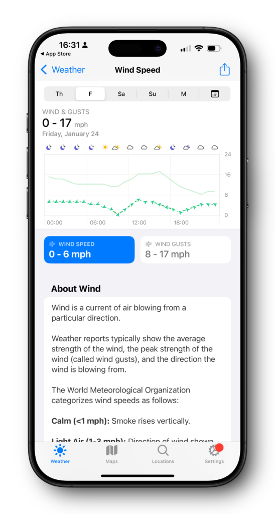
The wind has been on everyone’s mind in Southern California for the last few weeks. In addition to the tragic fires up in Los Angeles, down here in Orange County, everything is equally dry, and the wind is blowing equally fast. Last week, one night, we clocked it at 79 miles an hour in my backyard.
Somewhere along the way, I let my CARROT Weather subscription lapse. The Apple weather app has come a long way, and it’s just fine for general information like the temperature and forecast. But getting predictable wind information out of it is a pain in the neck. So much so that I re-upped with CARROT weather and, within seconds, had precisely the data I was looking for. While the Weather app is good enough for many people, CARROT Weather remains the king.
The Initial Response to the iPhone
The iPhone is now 18 years old, and it’s easy to forget life before it. I used mobile phones before iPhone, and the difference was night and day.

Over the years, we’ve heard a lot about how competitors put their heads in the sand when the iPhone was first announced. My favorite is the story about Blackberry not believing it was true, that Jobs had somehow faked everybody out with non-existent technology.
However, in a recent data release by Nokia, it’s clear that they took it seriously. Nokia immediately started shifting direction with its products in development, recognizing the value of the multi-touch user interface. People now say that the iPhone innovation was inevitable and that if Apple hadn’t done it, somebody else would have devised a smart phone with a flat slate of glass. But looking at contemporaneous documents, it sure doesn’t seem like it. (via John Gruber’s Daring Fireball.)


